Claude Design Review: AI Tool for Designing Landing Pages & Decks

Our guides are based on hands-on testing and verified sources. Each article is reviewed for accuracy and updated regularly to ensure current, reliable information.Read our editorial policy.
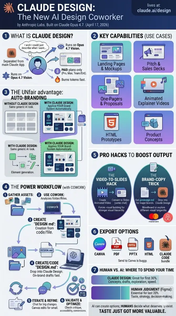
Anthropic just shipped another product, and it is aimed squarely at designers, marketers, and founders who keep saying “I wish I could just describe what I want and have something show up.”
It is called Claude Design. It launched on April 17, 2026 from Anthropic Labs. It runs on Claude Opus 4.7, their most capable vision model. And it lives on a different URL than the regular Claude app, which is the first thing that trips people up.
I spent a few hours with it. Some parts feel genuinely useful. Some parts are still rough. This guide walks you through both, plus the workflow I now use to get consistent on-brand output instead of the same generic AI look everyone else is shipping.
What Is Claude Design?
Claude Design is a separate product from the regular Claude chat. It does not live inside the desktop app or the browser version. It has its own URL: claude.ai/design.
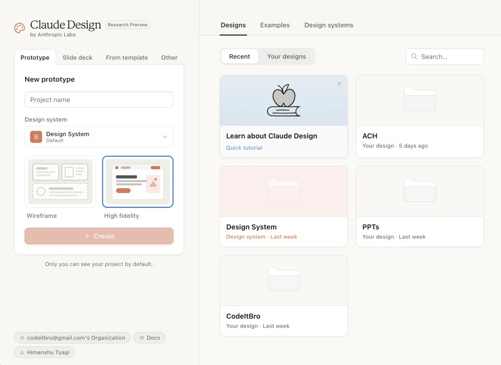
You describe what you want. Claude builds a first version on a canvas. You refine it through chat, inline comments, or by clicking directly on elements you want to tweak. When you are done, you export to Canva, PDF, PPTX, standalone HTML, or a handoff bundle for Claude Code.
It sits somewhere between an AI website builder, a slide deck generator, a visual brainstorming tool, and a design handoff assistant.
You can use it for:
- Landing pages and website mockups
- Pitch decks and sales decks
- One-pagers and proposals
- Animated explainer videos
- Marketing visuals and social assets
- Internal presentations
- HTML prototypes
- Product concept visuals
The thing that makes it different from the dozens of AI website builder products already out there is that it can read your existing codebase or design files and apply your brand system automatically. So your output does not look like the same generic AI template everyone else is shipping.
The launch hit Figma hard. Figma stock dropped roughly 7% on launch day, and Anthropic CPO Mike Krieger had quietly resigned from Figma’s board three days earlier. So while Anthropic publicly says Claude Design is meant to complement existing tools, the market clearly read it differently.
How to Access Claude Design
You need a paid Claude plan. The free tier does not get access.
If you are on Pro or Max: Just go to claude.ai/design and sign in. Done.
If you are on Team or Enterprise: It is off by default. Go to Organization settings → Capabilities → Anthropic Labs and toggle it on.
It is a research preview, so the rollout is gradual. If claude.ai/design bounces you back to the regular Claude home, wait a few days and try again.
Heads up — it burns through tokens fast. So if you are on a tight monthly cap, do not start a six-hour exploration session at midnight.
Three Quick Tests to Get a Feel for It
Before getting into workflows, run these three tests. Each takes under two minutes. They will show you what the tool can and cannot do.
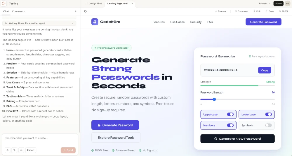
Test 1: Build a High-Fidelity Landing Page
This is the test that surprised me the most. I wrote a two-line prompt. Claude Design produced a complete landing page that looked shippable. No further edits.
Open the Wireframe tab. Select High fidelity. Then paste a prompt with this structure:
Create a high-fidelity landing page for [product name].

Product description:
[Briefly explain what the product does]

Target audience:
[Who this page is for]

Primary goal:
[Book a demo / join waitlist / buy now / raise funding / download app]

Tone:
[Premium / friendly / technical / bold / minimal / enterprise-grade]

Page sections:
Hero, problem, solution, key features, use cases, testimonials, pricing, FAQ, final CTA.

Design style:
Clean, modern, responsive, conversion-focused. Avoid clutter. Use strong visual hierarchy and clear CTAs.

Reference inspiration:
A mix of [reference site] + [reference site] + [reference site].
The reference sites part is the bit most people skip. It is the most important part. Claude Design has seen enough of the web to know what “Stripe-style polish” or “Linear-style minimalism” looks like. Give it three references and it will blend them.
Then click 1. Prototype + name → 2. High fidelity → 3. Create. Within a minute or two, you have a working page you can present.
Result:
Test 2: Generate a Slide Deck
Go back to the homepage and pick Slide deck. Use this prompt structure:
Create a 10-slide pitch deck for [company/product].

Audience:
[Investors / clients / internal leadership / sales team]

Goal:
[Raise funding / sell the product / explain strategy / train the team]

Slide structure:
1. Title
2. Problem
3. Market opportunity
4. Solution
5. Product demo
6. Business model
7. Traction
8. Competition
9. Roadmap
10. Call to action

Style:
Modern, clean, confident. Add speaker notes for each slide.
For better results, give Claude facts instead of asking it to guess. Add your market size, pricing, competitors, customer type, and key metrics wherever possible.
The output is solid for a one-shot. Claude Design’s slides come out structured better than most AI deck tools — almost like the model is thinking like a deck designer instead of a slide-by-slide bullet generator.
Test 3: Make an Animated Video
Click From template. You can either describe what you want in text, or sketch it and let Claude interpret. The sketch input is a nice touch even though my drawing skills are honestly embarrassing.
For the prompt, structure matters. Break the video into time blocks and describe the visual treatment for each:
Create a 30-second animated explainer video about [topic].

Format:
16:9.

Audience:
[Who will watch it]

Structure:
0–5s: Hook
5–12s: Problem
12–22s: Solution
22–27s: Key benefit
27–30s: Closing CTA

Visual style:
[Clean tech / flat illustration / bold startup / minimal / data-heavy]

Constraints:
No stock footage. No emojis. Keep text short. Use smooth transitions.
Don’t expect Pixar quality. Expect clean kinetic typography, smooth transitions, and on-brand visual storytelling that would normally cost real money to produce.
I created a video on Claude Design and exported it to Canva. See the results here.
The Video-to-Slides Hack
This is weird, and it works.
If you ask Claude Design for a slide deck directly, you get decent slides. But if you first ask it to make a 30-second animated video summarizing a topic, then ask the same chat to convert that video into a slide deck, the slides come out noticeably better.
The reason makes sense once you think about it. The video step forces visual thinking. The model has to commit to motion, pacing, and visual emphasis before it lays anything down as static frames. That visual logic carries over when it converts to slides.
Try this with any longform content. Drop a markdown file or a research report into the chat. Prompt:
Make a 30-second animated video that summarizes this for a first-time viewer.
Then in the same chat:
Now convert that video into a slide pitch deck.
You will get a deck with stronger visual hierarchy than if you had asked for slides on the first try.
The Best Claude Design Prompt Formula
Most weak AI design output comes from weak prompts. Use this formula:
Goal + Audience + Format + Content + Style + Constraints + Export NeedHere is what each part means:
- Goal: What should the design achieve?
- Audience: Who will use or view it?
- Format: Landing page, deck, video, one-pager, prototype, etc.
- Content: What must be included?
- Style: What should it look and feel like?
- Constraints: What should it avoid?
- Export Need: PDF, PPTX, Canva, HTML, or design handoff.
That structure is the same kind of thinking we covered in our guide on vibe coding prompting best practices — context first, role second, constraints last. Skip any one of those seven inputs and the output drifts toward the AI default.
The Real Workflow: Cowork + Claude Design
The single-shot tests are fun. But Claude Design is only as good as the design system you feed it. Without context, it produces the same modern-startup look you have already seen a hundred times.
Here is the workflow I now use for actual client work.
Step 1: Extract Your Brand System with Cowork
Drop everything you have into one folder. Logos. Past slides. Photography. Landing page screenshots. Your brand PDF if you have one. Product screenshots. Don’t curate — just dump.
Open Cowork. Select the folder. Then prompt:
Analyze this folder and produce a full design system write-up. Fonts, colors, graphical styles, component patterns, tone, layout conventions. Flag anything that is missing. Save it as DESIGN.md in my folder.
Cowork reads every file and outputs a clean DESIGN.md. Think of it as your brand guidelines distilled into a format Claude Design can actually use. If you already have a design system in code, link the codebase directly. Same effect.
Step 2: Use a DESIGN.md Template if You Don’t Have One
If you don’t have brand assets yet, you can write a simple DESIGN.md by hand. Here is a starter template:
# Brand Design System

Brand:
[Your brand name]

Audience:
[Who you are designing for]

Tone:
[Useful, clear, premium, playful — pick 2-3 traits]

Colors:
Primary: [hex]
Background: [hex]
Text: [hex]
Accent: [hex]

Typography:
[Font family for headings and body. Keep readable.]

UI Style:
[Tool-first / content-first / dashboard / marketing-led]
[Card style, spacing rules, button shape]

Buttons:
Primary CTA wording: [e.g., "Try It Free", "Book a Demo"]

Avoid:
[Things you never want in your designs — cartoon mascots, stock photography, gradient backgrounds, etc.]
Upload this file before generating designs. This one step prevents the “same AI design everywhere” problem.
Step 3: Generate With a Specific Prompt
Apply the seven-input formula. Skip any one and the output drifts.
Build a pricing page for [product]. 3 tiers, annual/monthly toggle, sticky CTA on mobile. Mobile-first responsive. Use our Primary Button component. Match the tone of our existing homepage.
Step 4: Iterate the Right Way
There are two places to make changes, and they each have a job.
Use chat for big structural changes. Examples:
- “Show me three alternative hero layouts.”
- “Make the page more conversion-focused.”
- “Reduce the text by 40% and make the CTA stronger.”
- “Make the deck more suitable for a B2B SaaS audience.”
Use canvas edits for small section-level changes. Click the edit button, select the exact element, and tell Claude what to change. The element gets highlighted in green so you know what you are editing. Examples:
- “Make this button more visible.”
- “Rewrite this headline in a clearer way.”
- “Replace this section with three feature cards.”
- “Increase spacing between these blocks.”
For risky experiments, save a branch first. “Save what we have, then try a completely different approach.” If the experiment fails, you roll back.
Step 5: Validate Before You Ship
Don’t export the first version blindly. Ask Claude to critique its own work. Run these prompts:
- “Review this design for clarity, visual hierarchy, and conversion issues. List exact fixes.”
- “Check this design for accessibility issues based on WCAG 2.1 AA. Give specific corrections.”
- “Generate desktop, tablet, and mobile versions of this design.”
- “Suggest two A/B test variants for the hero section. Use different positioning angles.”
- “Remove anything that feels generic, overdesigned, or AI-generated.”
That last prompt matters. AI design tools often add visual noise because they think more equals better. It does not.
For accessibility checks, use Claude’s review as a first pass, then compare against the W3C Web Content Accessibility Guidelines 2.1, especially for contrast, readable text, keyboard access, headings, and form labels.
Export Options in Claude Design
Anthropic supports five export paths. Each one fits a different workflow.
| Export Format | Best For |
|---|---|
| Canva | Social graphics, editable marketing assets, team handoff to non-designers |
| Final decks, proposals, one-pagers — anything meant to be read, not edited | |
| PPTX | Sales decks, investor decks, internal presentations that need light editing |
| Standalone HTML | Website prototypes, visual demos, click-through walkthroughs |
| Claude Code bundle | Developer handoff with design intent included for implementation |
One note from my testing: the Send to Canva button has been buggy. It does not always work cleanly, and the round-trip is not as smooth as Anthropic’s launch announcement suggested it would be. Hopefully that gets patched soon. The PDF and PPTX exports work fine in the meantime.
If you export raw HTML and need to clean it before publishing, the CodeItBro HTML Pretty Print tool formats messy markup into readable code in seconds.
The Brand-Copy Trick That Changed Everything
This part is the one I keep showing other people because it sounds fake until you try it.
There is a free site called getdesign.md. It hosts DESIGN.md files for major brands — Mastercard, Airbnb, Ferrari, dozens of others. Each file is a structured breakdown of that brand’s color palette, typography, layout patterns, and tone, formatted exactly the way Claude Design wants to read it.
Download the DESIGN.md for any brand. Drop it into Claude Design. Run your prompt.
You get output that looks like that brand designed it.
The same product brief, with three different DESIGN.md files attached, produces three completely different aesthetics. One looks like Mastercard’s corporate site. One looks like an Airbnb listing flow. One looks like a Ferrari product page. Same prompt. Different brand DNA.
Used responsibly, this is a goldmine for moodboarding, client pitches, or just exploring how a different visual language would treat your idea. Used irresponsibly, you can clearly see how this becomes a problem for original brand work. Treat it as inspiration, not as a shortcut to actual brand identity.
Best Claude Design Prompts You Can Copy
Here are five prompt templates I keep in a notes file. Adapt them for your own use cases.
Landing Page Prompt
Create a high-fidelity landing page for [product].

Goal:
[Main conversion goal]

Audience:
[Target users]

Sections:
Hero, problem, solution, features, use cases, proof, FAQ, final CTA.

Style:
Clean, modern, fast, conversion-focused.

Constraints:
Avoid generic AI visuals. Keep the copy short. Make the CTA clear.
Pitch Deck Prompt
Create a 10-slide pitch deck for [company].

Audience:
[Investors / clients / leadership]

Goal:
[Funding / sales / approval]

Include:
Problem, solution, product, market, business model, traction, competition, roadmap, team, CTA.

Style:
Premium, clear, confident. Add speaker notes to each slide.
Blog-to-Carousel Prompt
Turn this blog post into a 7-slide LinkedIn carousel.

Audience:
[Target audience]

Goal:
Make the post useful, save-worthy, easy to understand on mobile.

Style:
Bold headings, short copy, strong spacing, mobile-first layout.

Avoid:
Long paragraphs, weak hooks, generic graphics.
Website Redesign Prompt
Redesign this landing page for better clarity and conversions.

Keep:
[Things to preserve — brand voice, hero image, etc.]

Improve:
Hero message, CTA, feature hierarchy, trust signals, mobile layout, FAQ section.

Style:
Modern, simple, professional, fast-loading.

Output:
High-fidelity landing page concept with desktop and mobile versions.
Accessibility Review Prompt
Review this design for WCAG 2.1 AA accessibility issues.

Check:
Contrast, font size, button clarity, form labels, spacing, heading order, mobile readability.

Give:
A list of exact issues and specific fixes.
Where Claude Design Falls Short
I am genuinely impressed by what Claude Design can do. I am also not going to pretend it is perfect.
- Token consumption is steep. A long iteration session will burn through your monthly cap fast. If you are on Pro and use it daily, you will hit limits.
- It is buggy in places. Inline comments occasionally disappear before Claude reads them. Compact view sometimes triggers save errors. The Send to Canva export is hit or miss right now.
- You have less control than in Figma. If you need pixel-perfect manual control, you are still better off in a traditional design tool. Claude Design is great for the first 80%. The last 20% is still faster by hand.
- It can produce generic designs. Without a DESIGN.md or codebase context, you will see the same SaaS-style cards, gradients, dashboards, and hero sections again and again.
- Large codebases cause lag. Linking an entire monorepo can crash the browser. Anthropic’s own docs recommend linking specific subdirectories instead.
- Collaboration is basic. It is not yet fully multiplayer the way Figma is. You can share with org-scoped permissions, but real-time co-editing is limited.
- It still needs human judgment. Claude can create ten options. It cannot tell you which one is right for your users, your product, or your conversion goal.
None of these is a dealbreaker. They are reminders that this is a research preview, not a finished product.
Claude Design vs Figma: Should Designers Be Worried?
Claude Design is not a full Figma replacement. Not yet, anyway.
Figma still gives teams deeper control over components, design systems, collaboration, prototyping, handoff, and production design workflows. Claude Design is better viewed as a fast concept-generation tool that lives upstream of all that.
The overlap is still real. For rough drafts, first layouts, pitch decks, simple landing pages, and campaign concepts, Claude Design can reduce the need to start inside Figma. That changes the role of design tools more than it threatens any one of them.
The value of a designer shifts toward sharper judgment:
- Which version should ship?
- Does this match the brand?
- Will users understand it?
- Is the hierarchy correct?
- Is this accessible?
- Does this solve the business problem?
- What should be removed?
AI can create more options. Designers still decide what deserves to exist. That is the part that just got more valuable, not less.
Tips for Better Output in Claude Design
A short checklist I use before every Claude Design session:
- Give it real content, not placeholders.
- Add your audience and business goal in the prompt.
- Mention the format clearly.
- Use a DESIGN.md file or link your codebase.
- Ask for fewer sections, not more.
- Keep CTAs direct.
- Ask Claude to remove generic AI design patterns.
- Request mobile versions early, not as an afterthought.
- Run an accessibility check before export.
- Use human judgment before publishing.
The strongest results come from specific prompts and strict constraints.
Why This Matters Beyond Just Designers
The bigger story here is that AI labs are no longer just shipping models. They are shipping entire applications that compete with the tools their customers already use.
Claude Code came for engineers. AI-powered coding assistants rewired how a lot of us write software in under a year. Then Cowork came for knowledge workers. Now Claude Design is coming for designers, marketers, and anyone who has ever fought with a slide template at 11 PM the night before a pitch.
If you have been watching the rise of vibe coding, this is the design version of the same shift. You describe outcomes. The AI handles the implementation. Your job is to direct, evaluate, and decide what is good enough to ship.
That last part — deciding what is good enough — is the part nobody can hand off. Claude Design will produce ten different dashboard layouts in ten minutes. It will not tell you which one to ship for your specific users at this specific moment. That is taste. And taste is exactly the thing that just got more valuable, not less.
My Honest Take
I went in skeptical. Most AI design tools turn out to be marketing wrappers around the same template engine. Claude Design is not that. It actually generates the design instead of stitching pre-built components together.
For a solo operator like me — running a site, writing content, occasionally needing decks or landing pages — it is genuinely useful. Not because it makes me a designer, but because it gets me to a draft fast enough that I can spend my real time on judgment instead of pixel pushing.
For a working designer, the calculus is different. You will probably use it for exploration and first drafts, then finish in your existing tool of choice. That is fine. That is exactly how good tools get adopted in real workflows.
The window where you can get ahead by being early on this stuff is small. Spend an hour with Claude Design this weekend. Build something. Break it. Try the brand-copy trick. You will learn more in 60 minutes of hands-on testing than you will from any review, including this one.
About Himanshu Tyagi
At CodeItBro, I help professionals, marketers, and aspiring technologists bridge the gap between curiosity and confidence in coding and automation. With a dedication to clarity and impact, my work focuses on turning beginner hesitation into actionable results. From clear tutorials on Python and AI tools to practical insights for working with modern stacks, I publish genuine learning experiences that empower you to deploy real solutions—without getting lost in jargon. Join me as we build a smarter tech-muscle together.